The Issue
Your video results in different shapes or cutoff on varying web pages and devices. On some web browsers your video plays as desired, but on others, its less predictable.
Responsive Setting
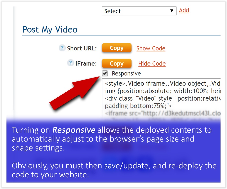
To make more video deployments browser friendly to more end users (your audience), turn on Responsive by checking its box in the iFrame or Java Script code settings.
If you do this after you have already deployed the code to your website or anywhere else, you must re-deploy the code after Updating your change.
Where to Find This Setting
While on the Videos page, click on Settings for the video player you wish to change.
While on the Video Details tab, you’ll see the various CODE sets. Click on Show Code to access the Responsive check box.
Sample of Non Responsive Results
When a player code-set is met with web browser settings that differ from its size/shape settings, the non-responsive player code can’t satisfy the mismatch. The result is the player code does not display as designed.
The sample here shows that occurrence, plus there appear to be two players deployed on the same page.